For the past couple of years Samsung, and many other Google partners, have been on the hunt to improve productivity on Android - particularly on tablets. We’ve seen hardware solutions (ASUS’ Transformer line) as well as software solutions (Samsung’s multi-window support) emerge. No one has really perfected the productivity story for Android tablets. I’m not entirely sure that long term even Google sees Android as the productivity platform of choice (perhaps Chrome OS will assume that role?), but there’s no shortage of attempts to solve this problem.
While ASUS was at the forefront of addressing the productivity issue for a while with its Transformer tablets, Samsung has since picked up the torch with its Galaxy Note family of devices. What started as a giant smartphone has now evolved to encompass an entire lineup of tablets as well. The productivity aspect of the Note line is really tied to the integrated active digitizer and stylus (S Pen) that comes with the devices. There are software and other features that complete the picture (e.g. IR blaster), but it all stems from the S Pen. Last year Samsung introduced the Galaxy Note 10.1, its first 10-inch tablet with an integrated S Pen. This year, Samsung expanded the line with an 8-inch model, the aptly named Galaxy Note 8.0.
Design
There’s a whole lot of excitement around sub-8” tablet form factors. It turns out that people like carrying their tablets with them, and smaller tablets make for better travel companions. There’s a lot of debate over what everyone settles on as the ideal form factor for tablets (and smartphones, notebooks, desktops), but for now we’re still in a period of wait and see.
There’s more clarity today than there was a few years ago however. The scene is still foggy, but some elements are coming into focus.
The 10-inch tablet market is on a crash course headed straight for the entry level ultraportable notebook market. Microsoft’s Surface Pro is a very early hint at that convergence. Long term I wouldn’t be surprised if we see the “traditional” 10-inch tablet market go away and be replaced by some form of a convergence device (read: tablet with a real keyboard solution). The 11-inch notebook market would be collateral damage in this scenario. Potentially hilarious outcome: if Apple or Microsoft actually make this happen, I wonder how Intel’s success will be graded on its Ultrabook campaign.
The smaller-than-10-inch category seems strong, at least for the somewhat near future. The success of the Nexus 7 and iPad mini proved that this form factor had life. Previous attempts failed because neither the software nor the hardware was ready. Some of Samsung’s first small tablets suffered from these problems.
Only a few short years later, the world is already very different. Android has matured into a real tablet OS, many of its UI performance concerns have been addressed and the hardware is much faster. While earlier attempts at building small Android tablets failed, the ingredients are ripe this time around.
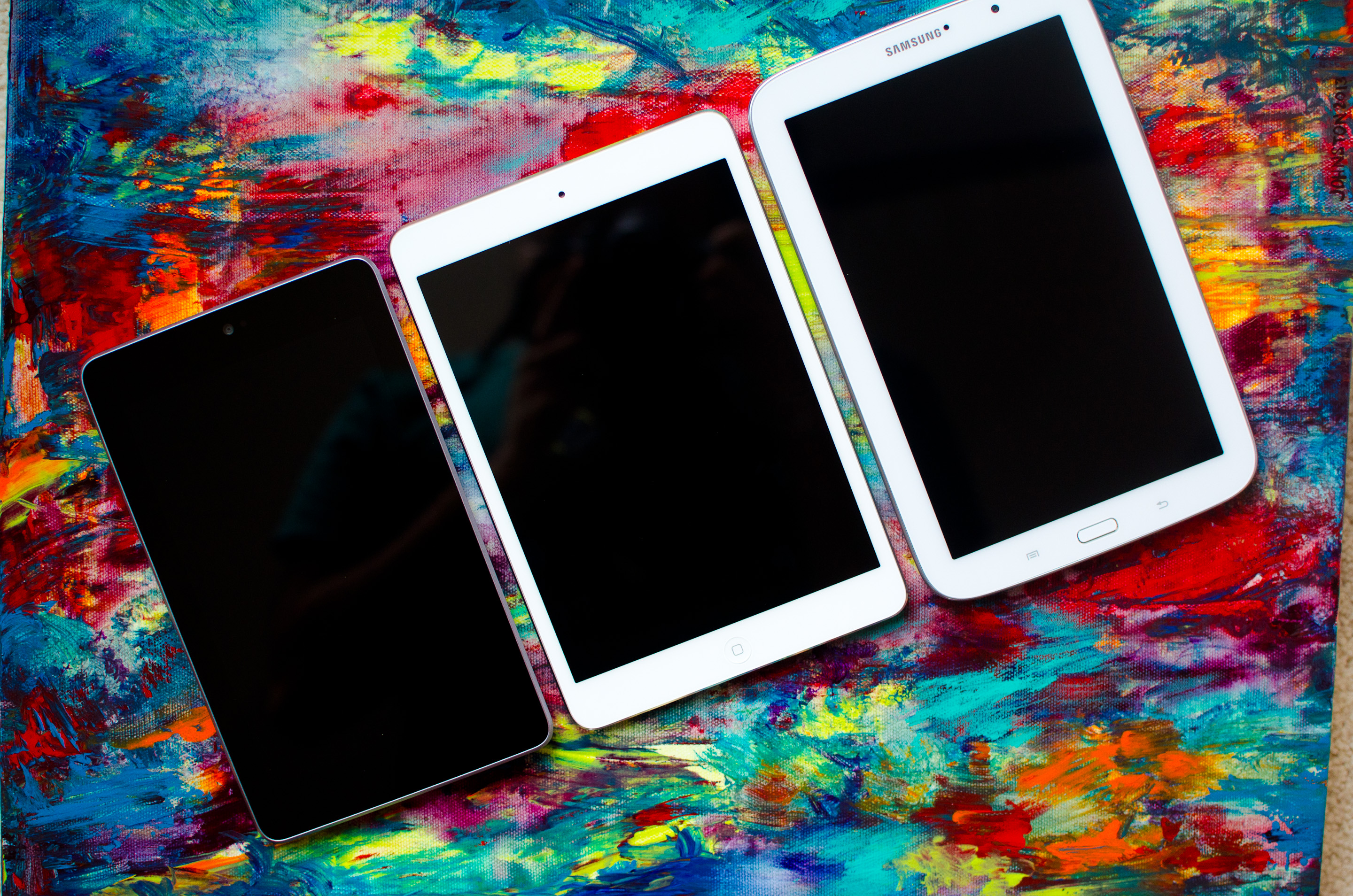
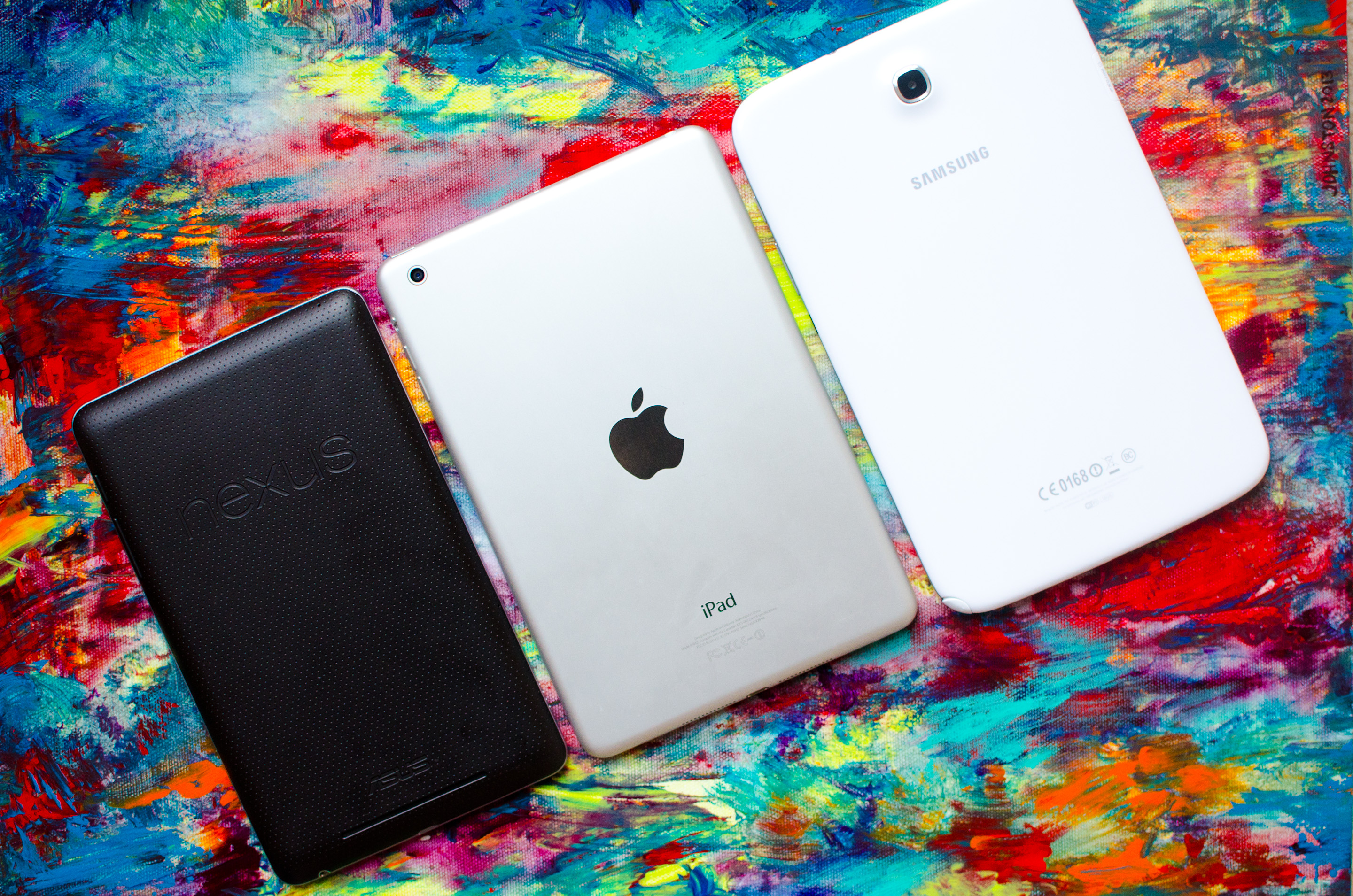
 From left to right: Nexus 7, iPad mini, Galaxy Note 8.0
Eight inches is an interesting choice for a Galaxy Note. Compared to the Nexus 7 or iPad mini, the Note 8.0 feels a bit larger. The dimensions on paper don’t look significantly bigger, but you are talking about a thicker, taller and slightly wider device than an iPad mini. The Note 8.0 doesn’t feel too big, just bigger.
The 8 is a bit too large to wield comfortably in a single hand, but it’s light enough where I really don’t mind carrying it around. For a tablet I’m only going to use at home in a single sitting location, I might want something larger. For something I’m going to carry around with me a lot, I want something more like the Galaxy Note 8.0, iPad mini or Nexus 7.
 From left to right: Nexus 7, iPad mini, Galaxy Note 8.0
Samsung loves its plastic enclosures, and the Note 8.0 isn’t an exception to the rule. Glossy white dominates the device. I don’t want to dwell too much on Samsung’s materials choice here other than to say it’s an obvious cost and weight savings play. Whether it matters or how much it matters really depends on how you are with your belongings.
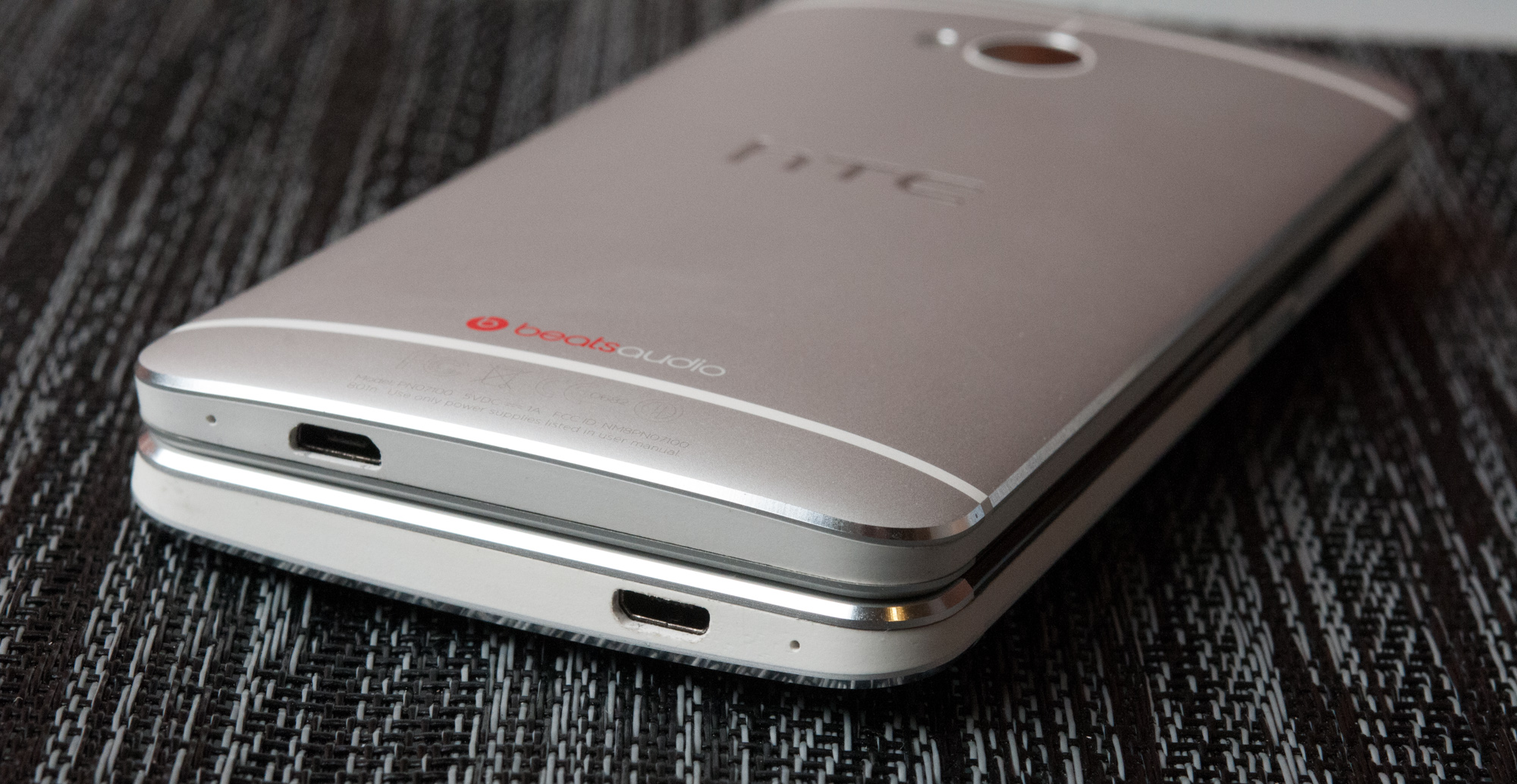
 Metal (bottom) vs. Plastic (top)
If you’re the type of person to value, polish and take care of the things you own, the Note 8’s construction doesn’t convey luxury. If you want something you’re not going to feel bad about tossing about like you would your keys or a bag, maybe a plastic tablet is less of a problem.
Upon its introduction, Apple made a big deal about the iPad mini having significantly more usable display area than the Nexus 7. The same complaints can’t be levied against the Galaxy Note 8.0, which features a display with 96% of the surface area of the iPad mini:
The iPad mini’s display is wider, while the Note 8’s is taller - a difference forced by having similar diagonal screen sizes (7.9” vs 8.0”) but vastly different aspect ratios (4:3 vs 16:10). In the 8-inch form factor, 16:10 works very well. Get too large and it becomes a bit awkward for portrait use in my opinion (see: Surface RT/Pro, although those are 16:9) but it’s not an issue on the Note 8.0. Whether or not you prefer 16:10 or 4:3 really depends on what type of content you’re viewing on the device. The former is perfect for video playback, while the latter is nicer for reading text.
The button layout on the front is the same as the Galaxy S 3 or Galaxy Note 2. There’s a physical home button flanked on either side by menu and back buttons. Both the physical and capacitive buttons serve double duty on the Note 8.0. Double tap the home button to bring up S Voice, Samsung’s answer to Siri, and long press on the home button to bring up the Android task switcher.
A long press on the menu button launches Google Now, while a long press on the back button brings up Samsung’s app launcher.
The app launcher is something Samsung has been toying with since the original Galaxy Tab. Back then the UI customization was horribly slow, but on the Note 8.0 it’s nice and quick thanks to advancements in Android as well as having far better hardware these days.
In portrait mode, along the left side of the device you’ll find a microSD card slot with removable plastic cover. On the opposite side are the usual culprits: power/lock and a volume rocker. Also along the right side of the device is an IR emitter, customary on all members of the Note family (as well as the Galaxy S 4).
There’s a single microphone on the Note 8.0, located just north of the power/lock switch. Along the top of the device is an 1/8” jack for headphones/mic, and on the bottom there’s a single USB 2.0 port.
Internally, the Galaxy Note 8.0 is distinctly last generation hardware - similar to what Apple did with the iPad mini. Samsung uses its own Exynos 4 Quad SoC, which features four ARM Cortex A9 cores running at up to 1.6GHz with ARM’s Mali-400MP4 GPU. The SoC is paired with 2GB of memory.
On the silicon front, the Note 8.0 outclasses the iPad mini in nearly every category. Faster CPU cores and 4x the memory capacity are really necessary to support Samsung’s multitasking focus for the tablet. The GPU is the only area where Apple potentially maintains an advantage. Interestingly enough, both the Exynos 4 Quad and Apple A5r2 SoCs are built at Samsung’s foundry on its 32nm HK+MG process. How’s that for coopetition.
Like the iPad mini, the Note 8.0 comes with 16GB of NAND on-board. Unlike the mini however, and sort of a trademark for Samsung devices these days, the Note 8.0 comes with a microSD card slot for additional storage. If that wasn’t enough, Samsung partnered with Dropbox to give Note 8.0 owners 50GB of free Dropbox storage for 2 years.
| iPad mini vs Galaxy Note 8.0 |
| Apple iPad mini | Samsung Galaxy Note 8.0 | Samsung Galaxy Tab 8.9 |
| Dimensions | 200 x 134.7 x 7.2mm | 210.8 x 135.6 x 7.95mm | 230.9 x 157.8 x 8.6mm |
| Display | 7.85-inch 1024 x 768 IPS | 8.0-inch 1280 x 800 PLS | 8.9-inch 1280 x 800 PLS |
| Weight | 308g (WiFi) | 338g (WiFi) | 453g |
| Processor | 1GHz Apple A5 (2 x Cortex A9, PowerVR SGX543MP2) |
1.6GHz Samsung Exynos 4412 (4 x Cortex A9, Mali 400MP4)
|
1GHz NVIDIA Tegra 2 (2 x Cortex A9, GeForce UL)
|
| Connectivity | WiFi , Optional 4G LTE | WiFi , Optional 3G/4G LTE | WiFi , Optional 3G |
| Memory | 512MB | 2GB | 1GB |
| Storage | 16GB—64GB | 16GB/32GB + microSD | 16GB |
| Battery | 16.3Wh | ~17Wh | 22.6Wh |
| Starting Price | $329 | $399 | $469 |
The Note 8.0 will be available in both WiFi-only and 3G/4G LTE versions. Samsung sent in the WiFi-only version for review, which is available in the US starting today at $399 for a 16GB model. The Galaxy Note 8.0 also comes with a $25 Google Play Store credit.